L.E.K:
Brand Identity
Brand identity work for L.E.K., a global strategy consulting firm known for analytical rigor and strategic insight. The project explored a visual system supporting L.E.K.’s positioning as a disciplined, insight-driven partner for senior business leaders.
The ChallengeL.E.K. operates in a category where differentiation is subtle and credibility is everything. The identity needed to convey analytical strength and confidence while maintaining clarity and composure across digital, print, and thought-leadership communications. The work also had to feel contemporary without abandoning the firm’s legacy and global reach.
Audience & InsightPrimary Audience
C-suite executives, private equity leaders, and senior decision-makers seeking strategic clarity.
Secondary Audience
Internal teams and brand stewards responsible for consistent application.
Insight
At inflection points, organizations need clarity above all else. A consulting brand must feel structured, decisive, and focused — helping leaders see what matters and act with confidence.
Approach & ProcessThe identity was built around the idea of inflection — moments where direction changes and decisions matter. The work emphasized structure, contrast, and hierarchy to express clarity and momentum while remaining disciplined and repeatable across complex content.
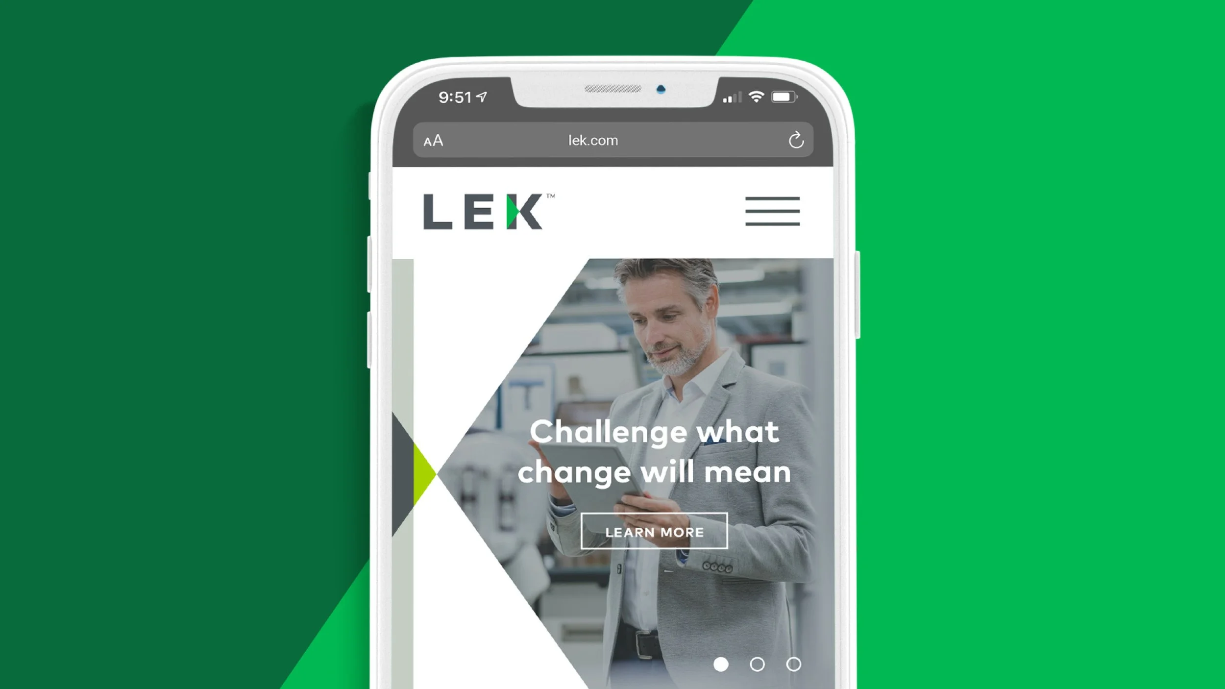
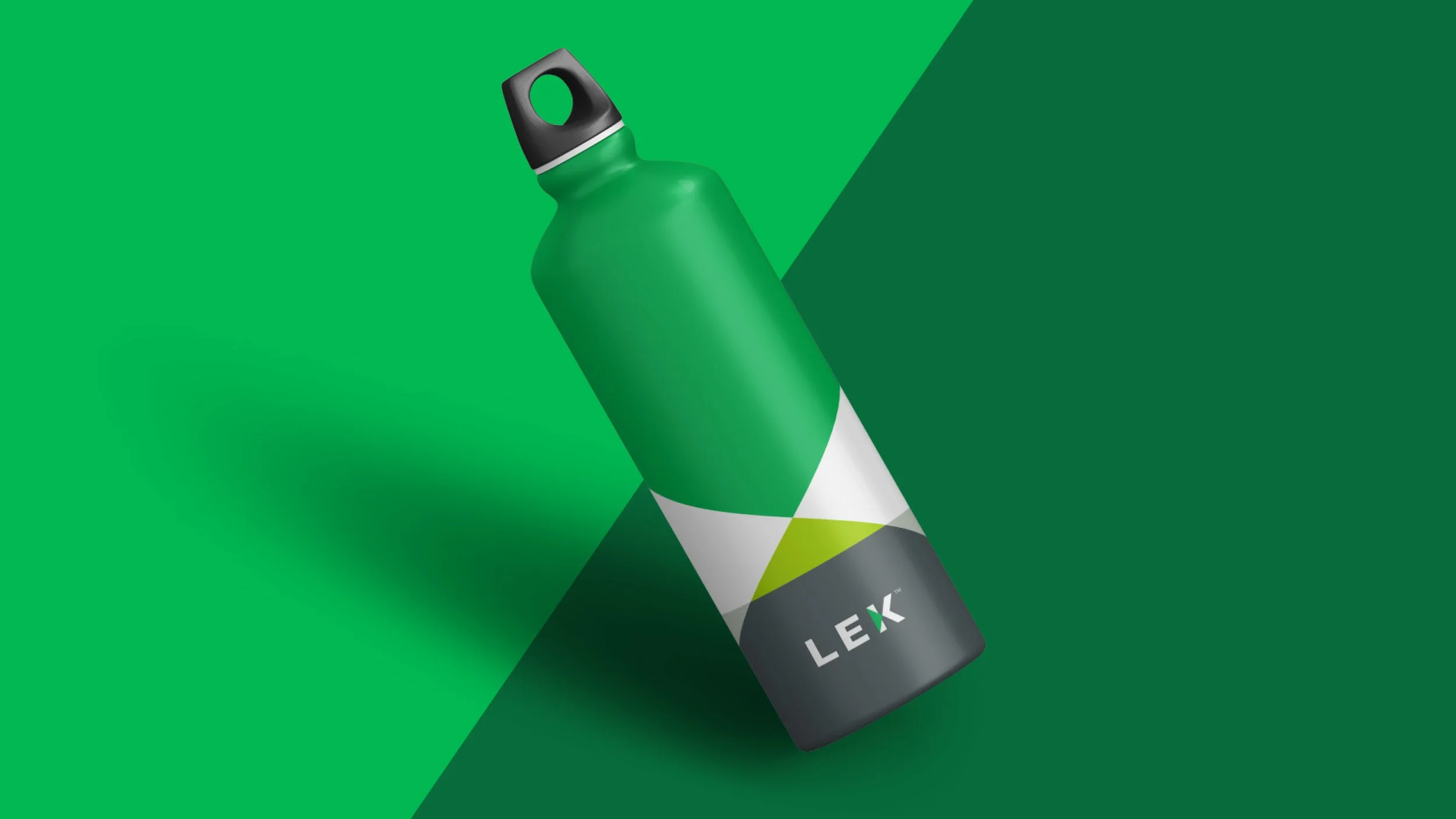
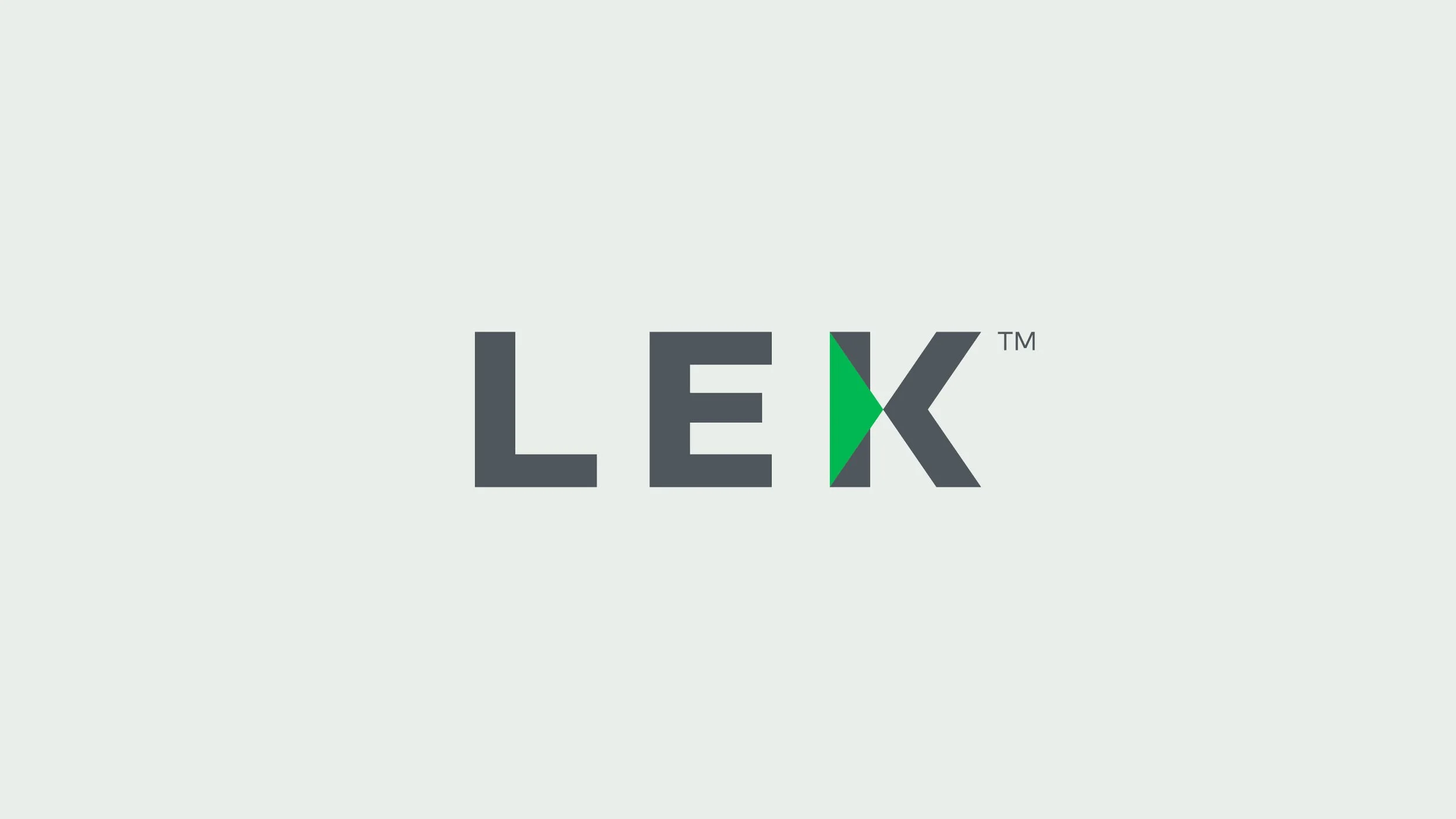
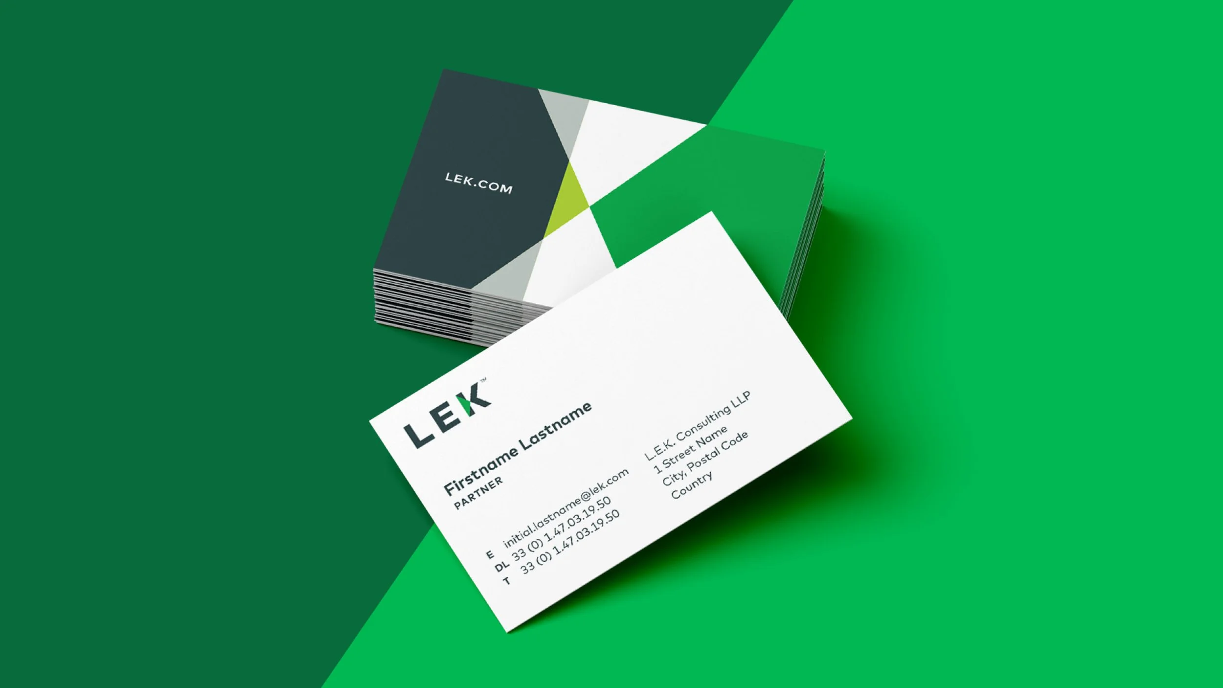
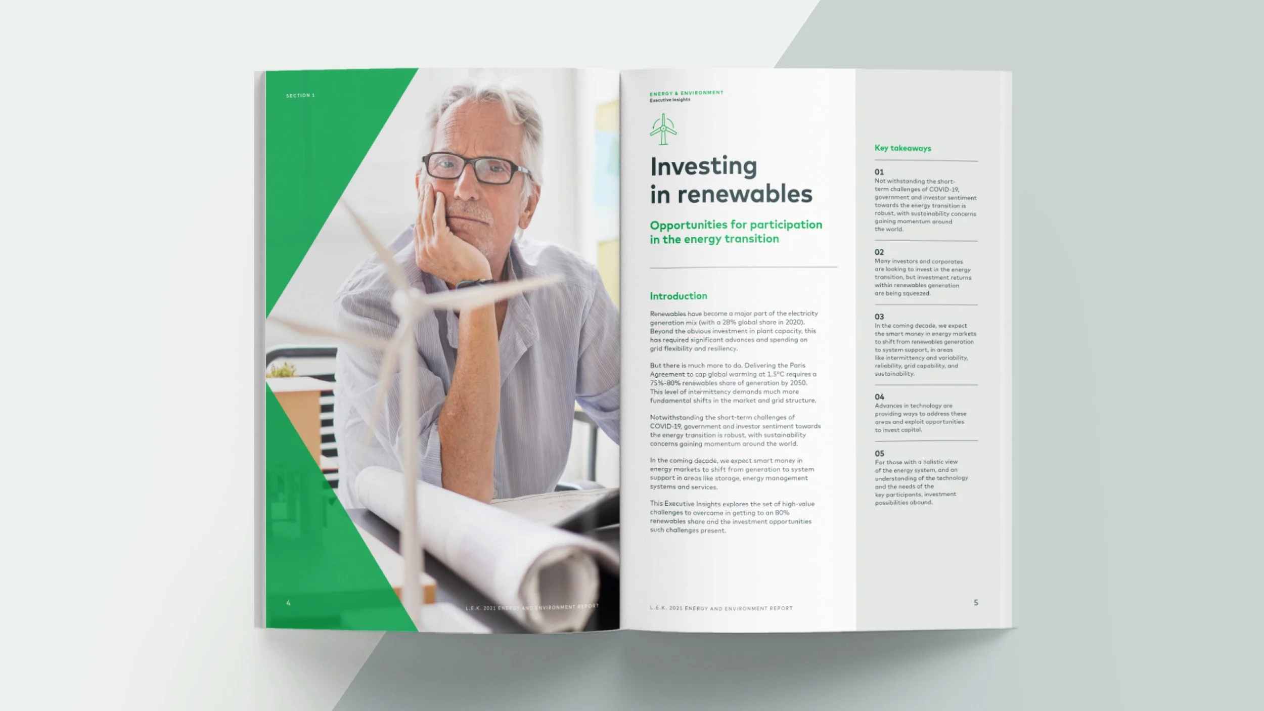
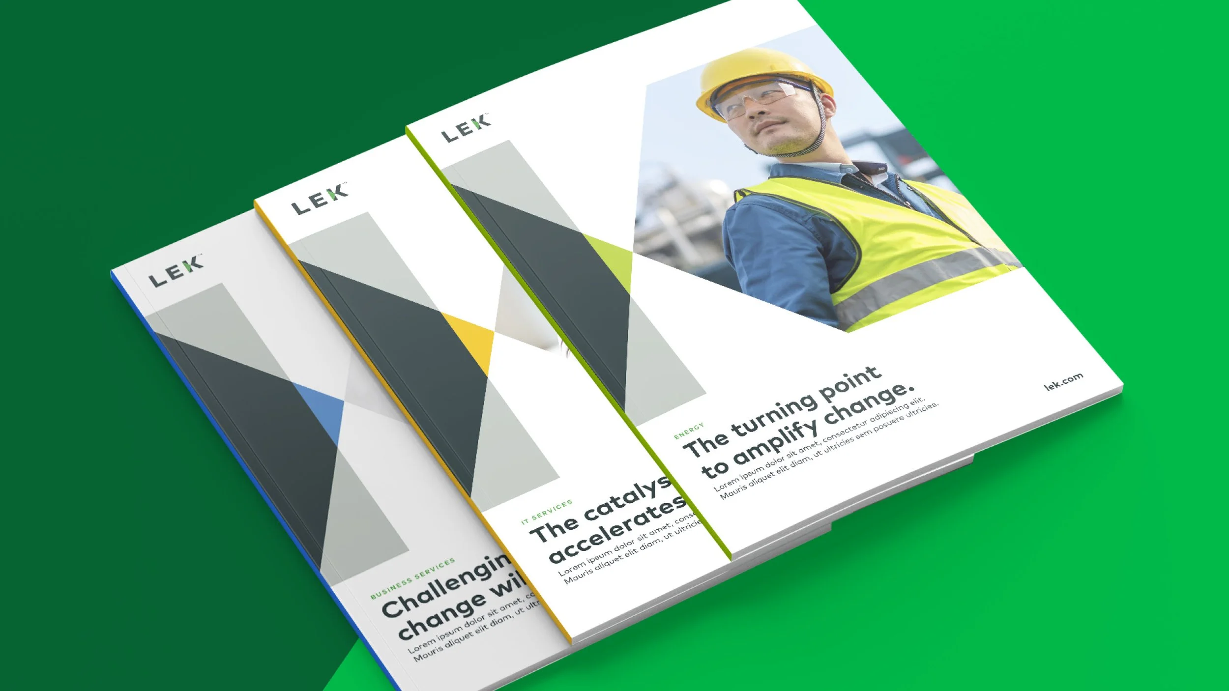
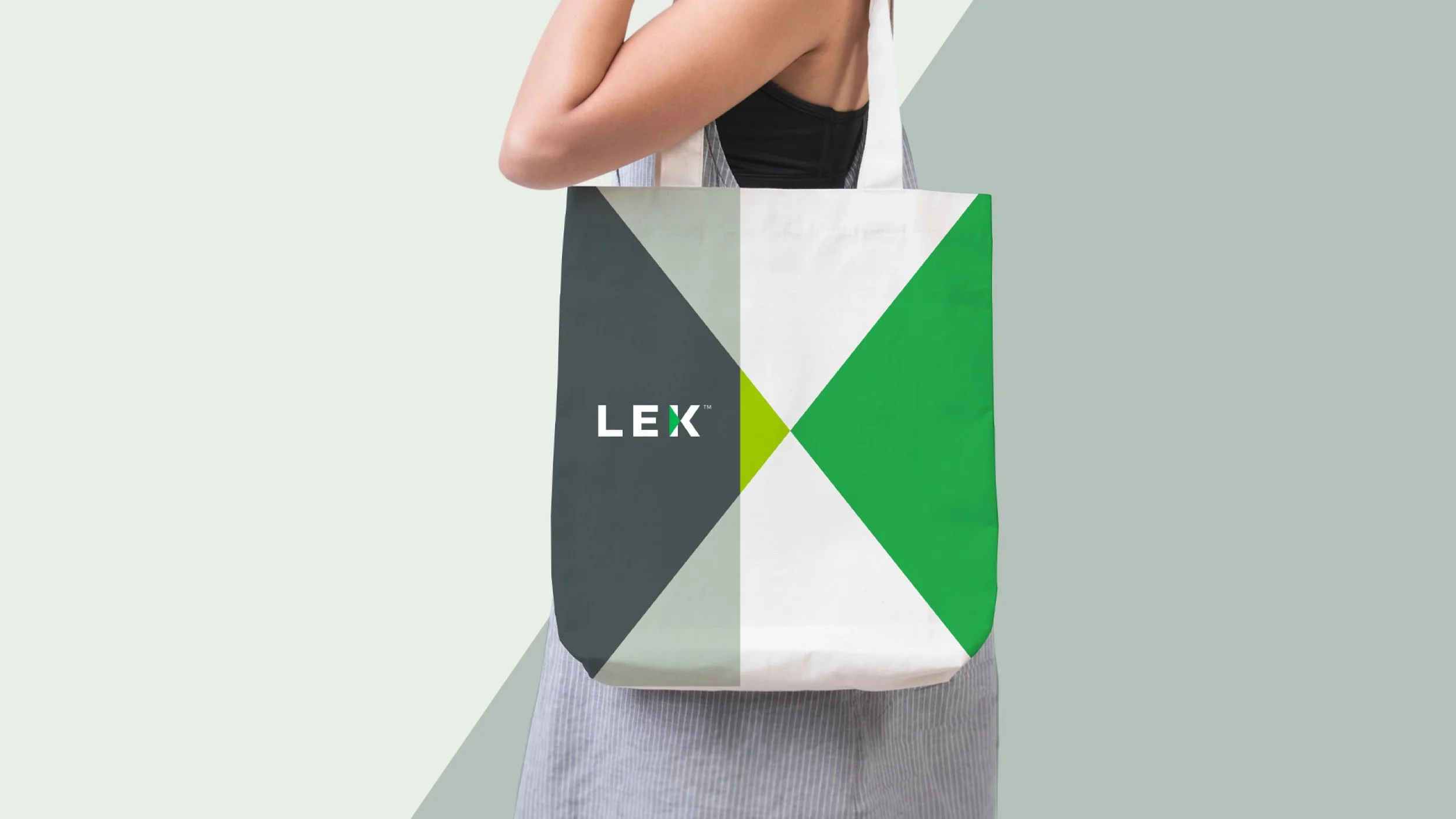
The SystemThe system is grounded in a strong typographic foundation with graphic elements that reference movement and directional change. Photography is treated with restrained color overlays to unify content and maintain focus. Illustration is used selectively to clarify complex ideas and reinforce key moments.
ApplicationsThe system was applied across thought-leadership materials, presentations, recruitment assets, and digital touchpoints. Each application reinforces the idea of focus and progression at moments of decision.
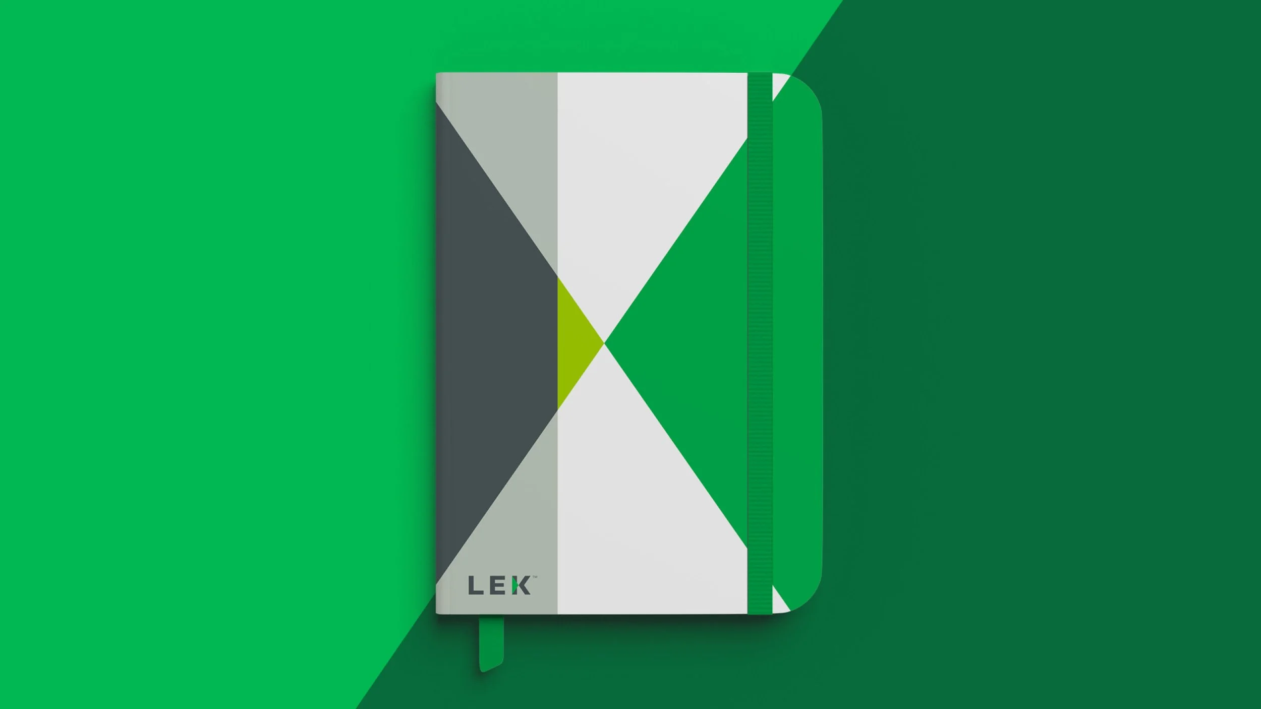
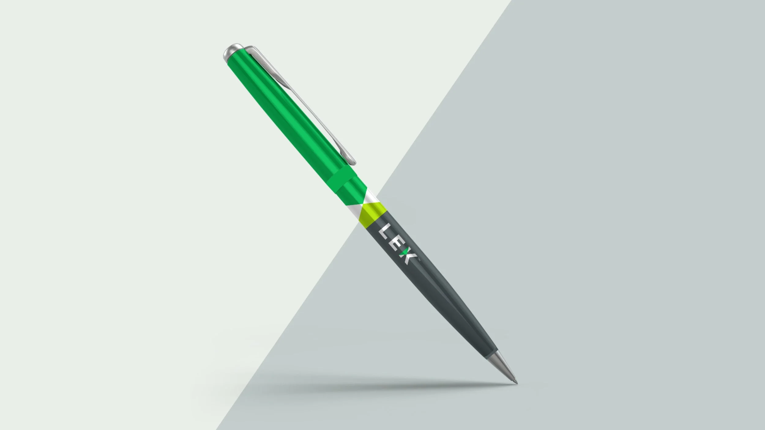
OutcomesThe system is anchored by a strong typographic foundation and a graphic motif derived from the logo. The motif visualizes an inflection point — a moment of directional change — and is used to create structure, rhythm, and emphasis across communications. Photography is treated with restrained color overlays to unify content and maintain focus across applications.
RoleDesign Director
Brand identity development, system design, and application guidance