Baylor Scott & White:
Brand Identity
Brand identity for Baylor Scott & White Health, one of the largest nonprofit healthcare systems in the United States. The work focused on establishing a clear, unified visual system that could scale across a complex, multi-facility organization.
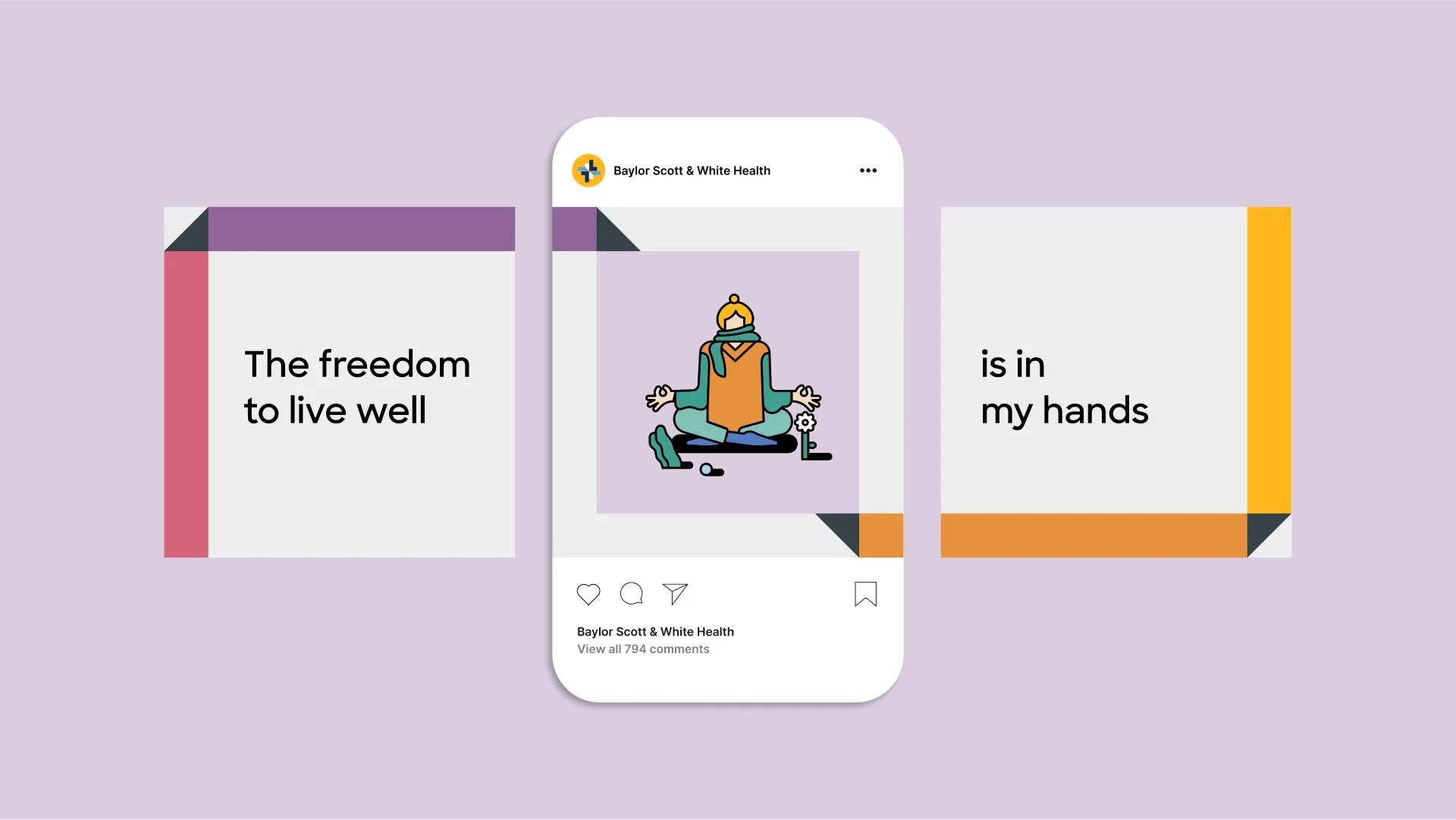
Brand illustration by Ty Dale.

The ChallengeAs a large, decentralized healthcare system, Baylor Scott & White needed an identity that could create clarity and consistency across diverse services, audiences, and environments. The brand had to function effectively in both clinical and patient-facing contexts while supporting long-term scalability.

Audience & InsightPrimary Audience
Patients and families navigating care across facilities.
Secondary Audience
Internal teams responsible for brand implementation.
Insight
Healthcare brands build trust through clarity, consistency, and human-centered communication.


Approach & ProcessThe identity was designed as a flexible system rather than a fixed mark. Emphasis was placed on clarity, hierarchy, and usability to support consistent application across environments and touchpoints. Illustration was art directed as part of the system to humanize communications and help explain complex healthcare information with warmth and clarity.

The SystemThe final system pairs a strong core identity with adaptable components. Typography, color, graphic elements, and illustration work together to ensure consistency while allowing flexibility across applications.
ApplicationsThe identity was applied across environmental graphics, print and digital communications, and patient-facing materials, reinforcing clarity and cohesion throughout the system.

OutcomesThe brand system provided a unified visual language that supports both internal alignment and patient experience across the organization.

RoleDesign Director
Led brand identity development, system design, and illustration art direction.